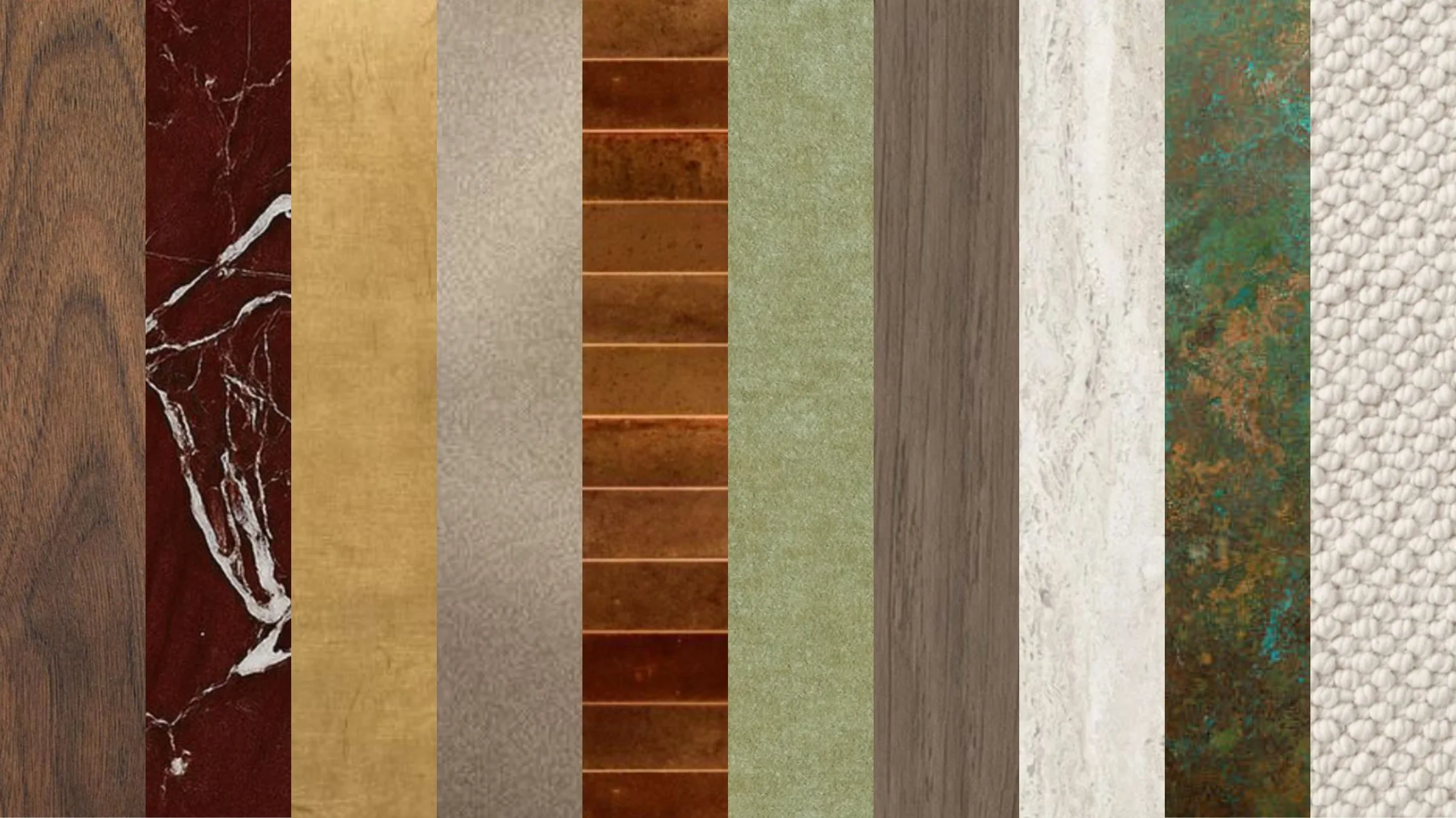
An autumn palette does not need to rely on obvious seasonal colour.
Warmth can come from the depth of timber, the movement of natural stone, the softened reflection of aged metal or the way a dense textile absorbs light.
The most convincing material palettes are built through contrast. Smooth beside textured. Reflective beside matte. Deep colour beside something pale and quiet.
This Edit brings together ten materials that can make an interior feel richer and more grounded as the light outside begins to change.
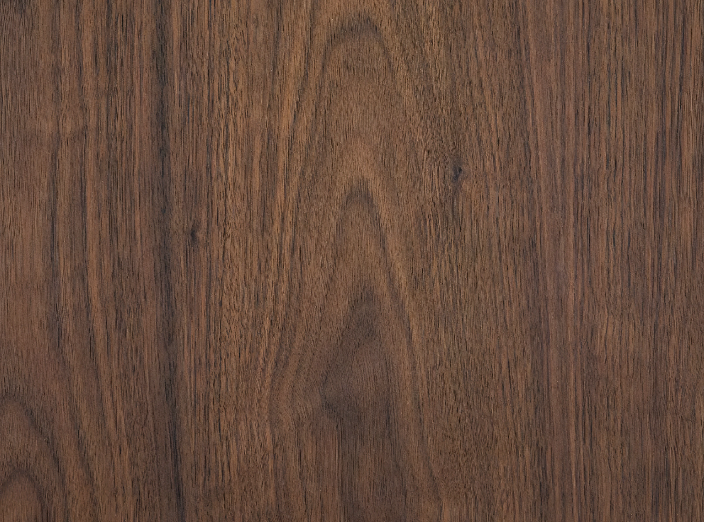
1. American Walnut
American walnut brings immediate depth through its rich brown colour and expressive grain. It can make large areas of joinery feel warmer, but it is equally effective as a smaller accent through furniture, handles or shelving.
Pair it with pale stone, warm white plaster and brushed metal. Avoid surrounding it only with other dark materials unless the room has enough natural light to hold the combination.
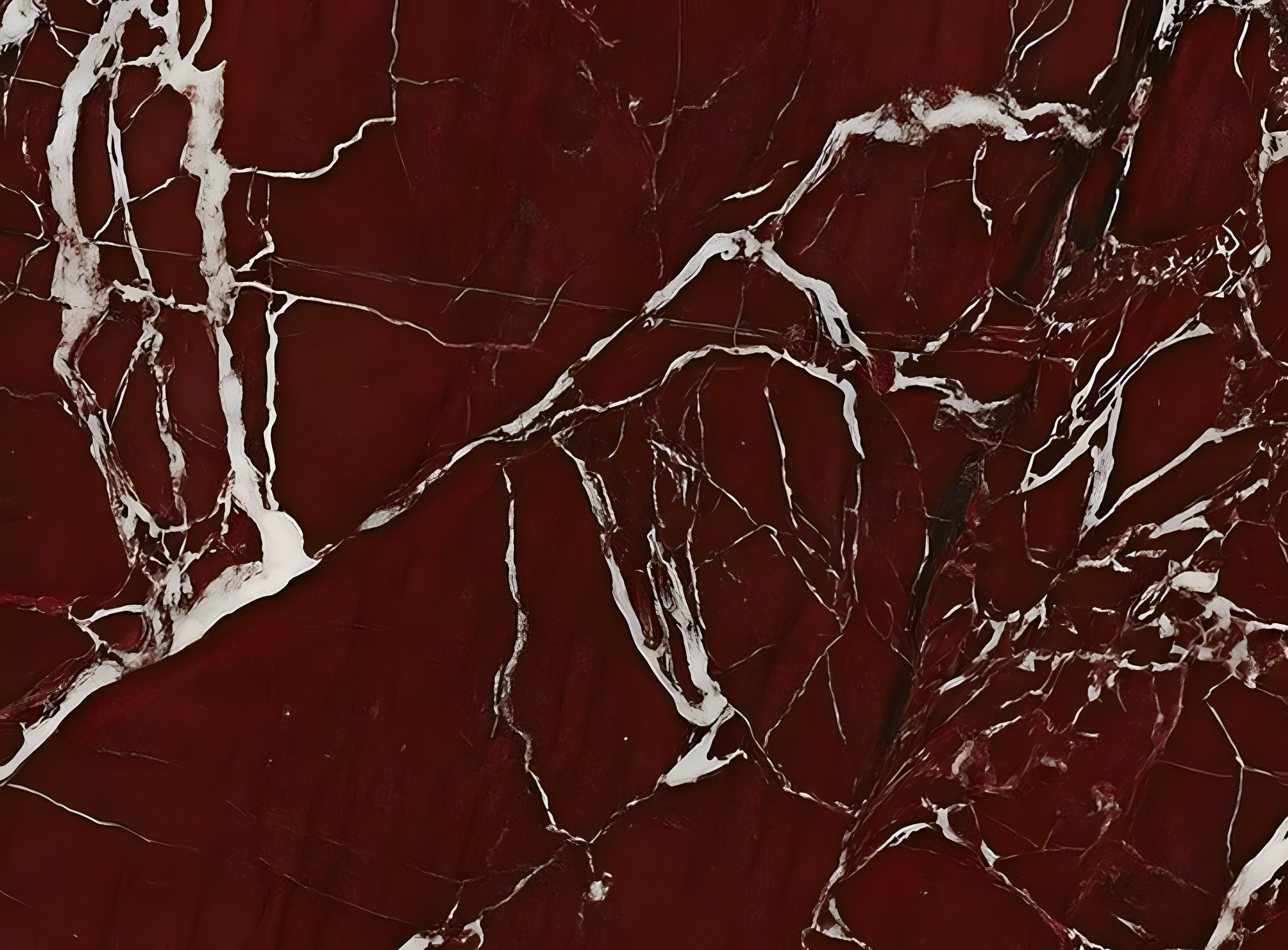
2. Rosso Levanto Marble
Rosso Levanto introduces deep burgundy, fine white veining and a polished sense of drama. It is strongest when used with restraint, allowing one table, fireplace or vanity to become the focus.
Pair it with dark timber, muted pink plaster, aged metal or warm neutral upholstery. Its colour is powerful enough that the rest of the room can remain quiet.





No comments yet. Be the first to share your thoughts.